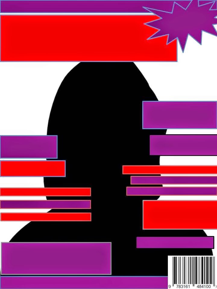
Mostly all magazines follow conventions however they can be challenged. A Conventions is a form which is follows typical aspects and dose not usually challenge them. the codes and convention for a magazine are; mastheads, barcodes, banners, main images, cover stories and feature story’s. By following the codes and convention it allows the audience to identify with the product creating a brand awareness it also familiarise the product with the reader therefore making it easier to navigate. However more controversial magazines will brake the codes and convention as their readers are seen to be more rebellious therefore by braking the cods they are breaking the rules which is appealing to there mode of address.

The NME is an example of music magazine that challenges thee codes and convention. The NME use photography that are not professional or manufactured looking, the pictures look like they have been taken at a gig this however will appeal to their audience as they enjoy going to gigs. Also the artist of group on the front cover don’t look smart of professional. This is done so the audience can connect with the artist as the target audience is young males who are not smartly dressed or professional people. The cover store's are typically coded to be in a line on the left and right hand side of the page whereas the NME are at the bottom of the page. By breaking the cod and conventions they are applying to there target audience which are white British males who are quite rebellious them selves therefore they like to break the rules.


Magazine such as 'GLAMOUR' and also CoverGilrl campaigns follow the cods as their female models are airbrushed and the images are extremely professional and manufactured they know that young girls and woman aspire to look like their hyper- real images of woman as this follows Maslow’s hierarchy of needs theory as they are dreaming and aspiring to look like something they can never look like as it is not real. Therefore this magazines cods and conventions help sell their product.
My music magazine is similar to the NME however I have targeted it at a female audience as there is a gap in the market for young girls aged between 17-21 who are in to Indie music as most magazine that appeal to guitar based music are predominantly targeted at males. My magazine follows the codes and conventions however I have challenged some cods as I wanted to have some aspect of the NME as my audience are still partially under this target demographic. A code I challenge was my main images on my front over. The artist Hannah Reid is not looking directly into the camera this is breaking the typical codes as it breaks direct address. I did this as I like the way she is looking into the distance which represent the future and the success that she will achieve, therefore my target audience can aspire and achieve this goal which will make them want to bye my magazine as they will feel like they are buying their dream when buying my magazine. I also did not dress my model in reveling clothing as I believe this degrades woman I wanted to represent her in a non-sexual way as I wanted my audience to know Hannah Reid for her amazing singing and achievements not for her body or looks.

Lot of woman are shot line with the male gaze this code is extremely common and controversial. If a woman model, actress or singer is on the front of a magazine she is usually in line with the male gaze this could mean she is showing a lot skin, or exposing her body parts, standing or posing in a sexual position which makes her look weak or vulnerable. Cheryl Cole on the front cover of Q magazine is inline with the male gaze she is licking her finger this has sexually connotation therefore she is being represented as a sexual object who is only good for pleasing a man. therefore cods can account for the way males and females are represented through the media.
.jpg)
Also this woman This woman is posing in a sexual position therefore she is being represented as a sexual object she is in line with the male gaze. the woman also looks submissive and weak which gives me impression that men are the dominate sex and woman are vulnerable. As my model for my magazine is not in a weak or submissive position I have represented her in a strong and powerful way.
Another way I challenged the forms and conventions of real media products is by not air brushing my images in my double page spread. Air brushing creates a hyper real perception of images. Which enhances the beauty of woman. I did not use Photoshop due to the fact that I didn't want my audience to aspire to look like my artist and feel like they had to be perfect when in fact that is not the real them. Also my target audience are not girly girls therefore airbrushing my images would not fit within my mode of address.
When developing and constructing my magazine I mostly developed my media product by using the forms and conventions from real media products. My front page for my magazine follows a lot of the conventions for a typical music magazine. The masthead is in the top left hand of the page this is a convention I didn't want to break as I still wanted my audience to recognize the brand therefore making it easier to connecting with them, also the name of my magazine is ‘VERVE‘ my audience can identify to this as The Verve are British Indie band therefore keeping my brand identity and appealing to my target audience. Another cod I did not challenge was banners which run throughout my pages, it allows my audience to know what special offers are available in the magazine and also on are website. I created a small anchor in the top right hand of the page to persuade my audience to visit my website to download a free track this promotes exchange because the fans need to be following us on social media site first creating a community. I am also creating synergy as the magazine comes with the fee code needed inside .

My cover story and feature stories follow aspects of the NME as they are scatted around the page whereas conventionally they are lined up on the left and right hand side of the page. I did this due to the fact that my target audience can relate to this magazine as they can identify it with the NME. My typography is quite plane and simple which fit my target demographic as it is similar to other indie music magazines. Also by the use of typography I could convey the importance of the artist who features the most for example Hannah Reid was written a bigger writing compared to the rest of the typography on the page as she is the main artist in my magazine therefore my audience are aware who the magazine is about. As the typography is quite plain and soft it allows my audience to feel relaxed therefore they an enjoy it more. I used buzz words like ‘WOW, FREE, EXSLCUIVE’ to entertain my audience and make my magazine stand out therefore making my reader wont to buy it. My front cover uses the ‘uses and gratification theory’ as I informed my audience of story’s such us up coming gigs and events.
My colour scheme is red, purple black I choose these colours as it is similar to the NME however the purple is used to convey that my magazine is targeted at females who are into this demographic however as it is not girly it also conveys that my magazine appeals to indie music. I also have the British flag as the background image on my front page enforcing patriotism I did this due to the fact that my magazine will mostly represent British independent band , which my target audience will be able to relate to as they like this music.
Men and woman are resented extremely different in the eye of the media due to the representation of different dreams and aspirations for example men represent power and money in the business world whereas woman are represented in a sexual way to appeal to men and other woman who aspire to look like them. therefore the way a magazine is cods it can account for the way males and females are represented through the media. therefore I have to be very careful in the way i have coded my magazine as I did not want to represent woman in a sexual or weak way. I also need to be careful when taking pictures of my model as to make sure not to shoot my model line with the male gaze, as this would represent her in a weak or sexual way.


.jpg)
.jpg)


.jpg)


.JPG)
.JPG)
.JPG)
.JPG)
.JPG)
.JPG)


.jpg)


.jpg)
.jpg)
.jpg)