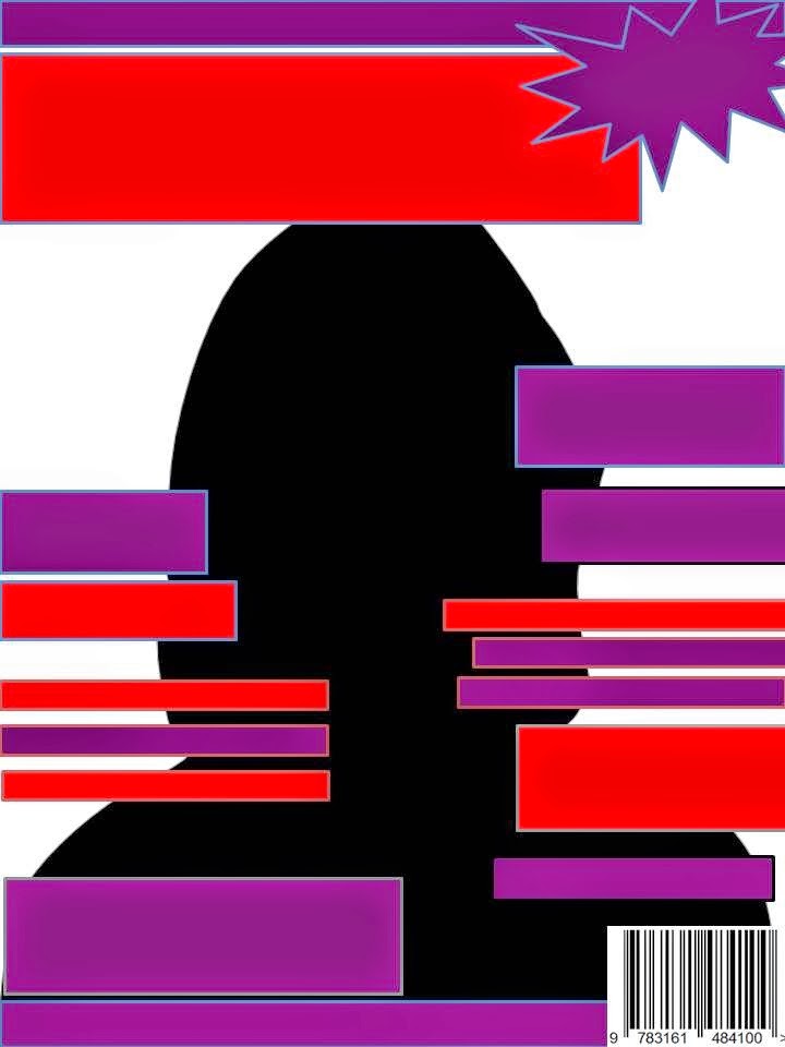
 The first question I asked in the focus group was what there personal opinion was, on my front cover design and to give me some feed back. The most popular desing was this templates, with a red, purple, and black colour scheme. As I am targeting my magazine at females the focus grope felt that these colours best suited my demographic rather than the dark blue and black. The first question I asked the focus group was ‘if these 4 templates where a music magazine front cover would you buy this magazine’ the response I got was positive as most people said ‘yes I would buy this magazine as I like the colours’ also most of them agreed that would be intrigued of who is on my front cover due to the fact that the model is not in line with the male gaze therefore she looks powerful and successful this reinforces the idea of Maslow’s Hierarchy of needs as my audience aspire to be as successful as my artists on my front cover which gives me the idea of their demographic that best fits there dreams. However they did not like the template with the male on the front as they said it was similar to the NME which is to masculine. I then came to the decision that I was going to target my magazine at females. with the other two templates the focus grope agreed that thee was to much going on with all the feature stories.
Contents Pages
.JPG) I then moved on to my contents pages, I again asked them to give me their personal opinion on my page design. As the grope liked the colour scheme from my front cover (red , purple and black ) this is due to the fact that they were starting to identify my product. I asked them If they preferred less images like the blue and dark contents pages or more images like this one the said the preferred more images and it makes it more interesting and easier to navigate around the contents page. They felt that the other contents pages where to dull and lifestyle and lacked interment and excitement compared to the one they preferred . They also said that the colour the theme is to dark. I also asked them if ‘ the main artist that was on my front cover should be the main pictures in the contents page they all agreed and said ‘ yes I think the main artists should be the main image as it makes the reader want to read further into the magazine. They also said that ‘the picture should mean something to the reader’ therefore I need to appeal to my audience and make sure what I feature in my magazine is meaningful and interesting to that demographic.
I then moved on to my contents pages, I again asked them to give me their personal opinion on my page design. As the grope liked the colour scheme from my front cover (red , purple and black ) this is due to the fact that they were starting to identify my product. I asked them If they preferred less images like the blue and dark contents pages or more images like this one the said the preferred more images and it makes it more interesting and easier to navigate around the contents page. They felt that the other contents pages where to dull and lifestyle and lacked interment and excitement compared to the one they preferred . They also said that the colour the theme is to dark. I also asked them if ‘ the main artist that was on my front cover should be the main pictures in the contents page they all agreed and said ‘ yes I think the main artists should be the main image as it makes the reader want to read further into the magazine. They also said that ‘the picture should mean something to the reader’ therefore I need to appeal to my audience and make sure what I feature in my magazine is meaningful and interesting to that demographic.I have come to the con that am going to use a lot of images as it’s a more interesting way to present information to my audience rather than a lot of writing on the page the focus group said it is also easier for them to navigate around the page.
Double Page Spread
.JPG) Lastly I asked my target group to give their personal feedback on my double page spread templates I got the same resonance that they liked the colour scheme red, purple and black which has continued throughout my front cover, and contents page. They said they liked the idea of my main artist on the double page spread and the was I have designed it to look like a collage ‘its seems more realistic than a ordinary picture also making it more interesting to lock at’ making the audience want to read the article. They also gave me some good feed back which was to add an additional story that was not relevant to that artists therefore I am going to add ’Albums of the Week’ adding more varied information to the page.
Lastly I asked my target group to give their personal feedback on my double page spread templates I got the same resonance that they liked the colour scheme red, purple and black which has continued throughout my front cover, and contents page. They said they liked the idea of my main artist on the double page spread and the was I have designed it to look like a collage ‘its seems more realistic than a ordinary picture also making it more interesting to lock at’ making the audience want to read the article. They also gave me some good feed back which was to add an additional story that was not relevant to that artists therefore I am going to add ’Albums of the Week’ adding more varied information to the page. .JPG)


.JPG)
.JPG)
.JPG)
No comments:
Post a Comment