Friday, 9 May 2014

CONTACT SHEET

  
I chose this image for my contents page as it represents Hannah Reid in a strong way as she is not in line with the male gaze therefore my audience an aspire to be here as she locks very strong, powerful and successful.  I also chose this image as it looks the most attractive compared to the rest also  the lighting  is better quality  than the rest.
I choses this images as I felt it fitted my demographic for my magazine the best due to the fact that Hannah Reid is looking attractive but yet confidant as she is not in a week position therefore she is not in line with the males gaze, my audience can relate to my artist as she is being represents in a successful way.

When taking my pictures I needed to take into account of the hazards that could occur when taking my images such as lose wires and someone could trip over I also needed to prepare for my photo shoot and check the weather forecast so I knew if the sun would be shining therefore my pictures come out with better quality of lighting, I also needed d to make sure it was not raining .

Monday, 5 May 2014

FOCUS GROUP EVALUATION


After creating my templates I need find out what my target audience preferred out of my front page, contents page and double page spread. In order to do this I  have conducted a focus group with 8 people who fit my demographic. By conducting a focus group it will help me get an understanding of how to construct my magazine to appeal to my demographic so they therefore purchases my magazine. I asked my target audience six questions which I have produced in order to get the best results. After I evaluated the results and thought through each design template and came to a desion on how to construct my pages whilst appealing to my target audience .

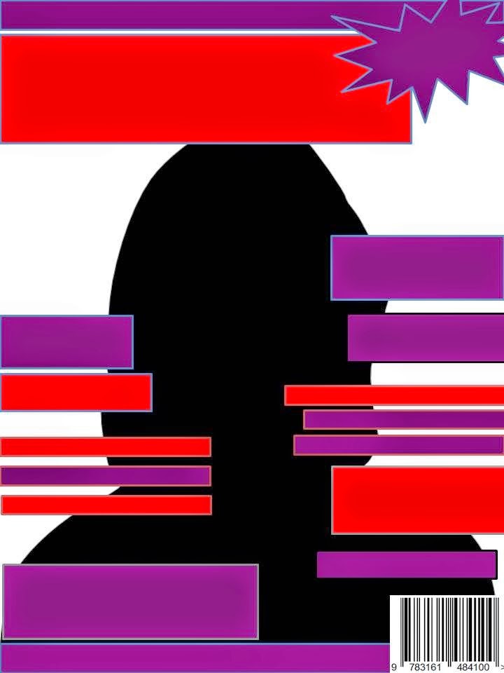
The first question I asked in the focus group was what there personal opinion was, on my front cover design and to give me some feed back. The most popular desing was  this templates, with a red, purple, and black colour scheme. As I am targeting my magazine at females the focus grope felt that these colours best suited  my demographic  rather than the dark blue and black. The first question I asked the focus group was ‘if these 4 templates where a music magazine front cover would you buy this magazine’ the response I got was positive as most people said ‘yes I would buy this magazine as I like the colours’ also most of them agreed that would be intrigued of who is on my front cover due to the fact that the model is not in line with the male gaze therefore she looks powerful and successful this reinforces the idea of Maslow’s Hierarchy of needs as my audience aspire to be as successful  as my artists on my front cover which gives me the idea of their demographic that best fits there dreams.  However they did not like the template with the male on the front as they said it was similar to the NME which is to masculine. I then came to the decision  that I was going to target my magazine at females. with the other two templates the focus grope agreed that thee was to much going on with all the feature stories.


Contents Pages

I then moved on to my contents pages, I again asked them to give me their personal opinion on my page design. As the grope liked the colour scheme from my front cover (red , purple and black ) this is due to the fact that they were starting to identify my product.  I asked them If they preferred less images like the blue and dark contents pages or more images like this one the said the preferred more images and it makes it more interesting and easier to navigate around the contents page. They felt that the other contents pages where to dull and lifestyle and lacked interment and excitement compared to the one they preferred . They also said that the colour the theme is to dark. I also asked them if ‘ the main artist that was on my front cover should be the main pictures in the contents page they all agreed and said ‘ yes I think the main artists should be the main image as it makes the reader want to read further into the magazine. They also said that ‘the picture should mean something to the reader’ therefore I need to appeal to my audience and make sure what I feature in my magazine is meaningful and interesting to that demographic.

I have come to the con that  am going to use a lot of images as it’s a more interesting way to present information to my audience rather than a lot of writing on the page the focus group said it is also easier for them to navigate around the page.


Double Page Spread
Lastly I asked my target group to give their personal feedback on my double page spread templates I got the same resonance that they liked the colour scheme red, purple and black which has continued  throughout my front cover, and contents page. They said they liked the idea of my main artist on the double page spread and the was I have designed  it to look like a collage ‘its seems more realistic than a ordinary picture also making it more interesting to lock at’ making the audience want to read the article. They also gave me some good feed back which was to add an additional  story that was not relevant to that artists therefore I am going to add ’Albums of the Week’  adding more varied information to the page. 


Friday, 2 May 2014

My Magazine- Double Page Spread


My Magazine- Contents Page


My Magazine- Front Page


Research- Annotations of Existing Text

Front Cover- Q Magazine 


Front Cover- NME Magazine 
Front cover the NME and Q are similar magazines as they target similar audiences and demographics, which is males/females aged between 17-25. However Q magazine has a wider music rage that is represent throughout its magazine whereas the NME predominately represents guitar- indie based music and artist.

As Q magazine has a wider and more mainstream audience than the NME it has represented there artist (Cheryl Cole) in  line with the male gaze to appeal to all there audience. She is being represented as sexual desire to men. Due to the fact that; Cheryl Cole is looking directly into the camera therefore she is creating direct address which makes her look extremely strong and sexy. By licking her ring she is viewed in a sexual way and has become desirable to men therefore she is in line with the male gaze . Female fans will aspire to be sexually confidant like her and to the power that she has over men. Also she will attract male readers to the magazine as they are sexually attracted to her.  Throughout my research process I have found that the NME hardly ever represent woman as sexual objects or in line with the male gaze, as there audience aspire to achieve the success of the artist rather than looking like them.  Florence has been represented as a strong female as she is looking directly in to the camera representing her in a confidant way, also she is not showing any flesh or her body therefore she is not being viewed as a sexual object. The image is an extreme close up which conveys a meaning of achievement and success and she is not does not need her body to hide behind. Therefore as I am constructed my magazine similar to the NME I have decided to follow their convention and not represent woman in line with them male gaze.

Both the NME and Q magazine have the same conventions and they have coded them to represent a rock ‘n’ roll theme throughout the magazines. However the NMEs typography is more plain and simple as it allows Florence to shine through and stand out,  whereas the typography in Q magazine is big and bold which portrays a more rock ‘n’ roll theme running throughout the front cover. Both magazine banners are advertising there magazine instead of the artist inside the magazine . Q says e ‘The UKs biggest music magazine’ NME- ‘Introducing the NME 2 of 10 special cover’. This is unusual as normally magazine banners promote what in the magazine to inform the reader. 


The Vibe- Contents page

Contents Page- Q Magazine 

Both Vibe and The NME contents page are targeted at very different demographics. VIBE magazine is targeted at young teenagers pronominally black males who are into R&B. whereas Q magazine is targeted at teens who are white and into a range of music but predominately indie music. However both contents pages do the same job they are designed to navigate the reader around the page in a easy but interesting way, and still keeping the brand identity the whole way through allowing the reader to feel connected to the magazine. They do this with the use of text, as well as images however each magazine differs due to the fact that they 
have different demographics.

Within Vibe and Q contents page they have continued their 3 colour scheme which allows the reader to recognise the brand. However both contents pages have different colour schemes as they need to appeal to their target audience and fit their mode of address.  Q and Vibe have chosen one main image on their contents pages rather than a lots of different images. It allow the feature artist to stand out. Q magazine has a review section which keeps the reader interested whereas the features section gives the reader a sense of sensibility as they can identify it.

The biggest image whining the contents page  relates  to the front cover as well as  the double page spread. This is due to the fact that this artist is the main selling point for that moths/week’s issue of the magazine. Alongside the images in the contents pages there are anchors which are in place to give the image meaning and to inform the reader what that image is about. Also it gives information on where to find this particular story. This a common conventions within contents pages.

Vibe magazine has shot their female model in line with the male gaze  to attract there male demographic as they will be sexual attracted to the model. However the NMEs main image is of 4 males  who standing on a hill as they are at a high potion they look strong representing men as the stronger sex. Therefore by the different cods in each magazine the representation of gender can change. 


Double page- Q Magazine


Double page Spread- The NME 


Double Page Spread-The NME 

Within Q magazine and the NMEs  double page spread you can notice that they are targeted at different demographics by the way they are coded. Q magazine is aimed at a more sophisticated audience this is represented through the main mage of Lady Gaga as the image is in black and white it creates and expensive representation therefore this suggest that the demographic are intelligent. Whereas the NME has a younger audience and tries to appeal to them with sexual innuendos and  rebellious artists such as Lily Allen

Both Q and NME double page spreads are is dominated by one main image, however the radar page of the NME has other little images informing the audience of new artists. Q magazine does not need other images as the Lady Gaga image is strong enough on its own as it is in line with the male gaze however Lady Gaga nudity is conveyed in a way which is modest and fashiabe as she is wearing the necklaces around her neck. Therefore she is represented in a sexual but powerful way. The NME have played up to the stereotypes of the teenage boy but shooting  them on a bed behind posters of woman showing flesh this represents them as sexually curious. Also the room is messy this shows that they are going against their parents by not tiding there room therefore representing them In a rebellious way.

By representing Lily Allen as rebel this fits into the target demographic of the NME as stereotypically people who listen to indie/rock ’n’ roll  music are seen as rebellious or naughty teens therefore appealing to their audience.

Q magazines double page spread has known title this is unusual however the large ‘L’ has replaced the title linking the artists initials within the article, as the ‘L’ has a red tint it reinforces the magazines brand identity and familiarises the reader. .


All three double page spreads follow the typical conventions such as; columns, main image, quotes, and heading. By following the conventions it creates a brand identity which the reader can  relate to therefore feeling a connection to the brand.  

Thursday, 1 May 2014

Planing- Templates


After finishing my rough designs for my magazine I wanted to improve theses and develop them further therefore I constructed them on to Power Point and created templates. I designed 3 different front covers testing what colours scheme I should use and positions of text. I also did the same for my contents page and double page spread. I am then going to get qualtive feedback and find out what my target audience prefer, which will help me later on in the construction process of my magazine pages.

As I am going to ask a focus grope on what their options are of my templates I have given a variety of colours that they can choses from.  One option I considered is red and purple and another is black, blue and purple. As my music magazine is representing indie music the colours I have chosen are not too bright therefore fitting my mode of address as it is not mainstream therefore will be able to relate to the magazine. Also with the colour red and black it is very similar to the NME and Q magazine which are under the same demographic and they target the same audience as my magazine. I have added the colour purple as I am targeting my magazine at females it adds a sense of femininity without being to girly this fits my mode of address as my target audience are not too girly, also  I will need to nwash  myself from other indie music magazines such as the NME as they predominantly target their magazines at males therefore my female audience will feel they can relate and identify my band.  Therefore I will be appealing to my target audience.

Front Page- Template

As I had been doing a lot of research I could add in a lot of conventions that I have found in the researching process from exciting media products. These conventions include; banners, mastheads, feature stories, barcode, main image date and price, I created 4 pages with different colours and positions of feature stories to give my focus grope a variety of choses to choses from and give me feedback and their opinions after these results I could come up with a final decision, and start the construction of my own music magazine pages. 


Contents Page- Templates
For my contents page I have also used many conventions that i found in my research process. These conventions include; page numbers, issue number, picture and stories. The most common convention I found when researching existing magazines was that contents pages are titled ‘Contents’ and also the contents page are full of images this can be seen in the NME and Q magazine. As these magazine have similar target audience and demographic as I do I have decide to base my contents page with lots of images I also believe it makes the contents page look entertaining and easier to navigate. I created 3 contents templates with different colours and styles. 
 Double Page Spread- Templates 
For my double page spread I have also used conventions that I f have found out during the research process of this task. These conventions include; 3 columns, drop capitals, quotes, and lot of images of my feature arties from my front cover. For my double page spread I designed 3 templates with different colour schemes and different styles.